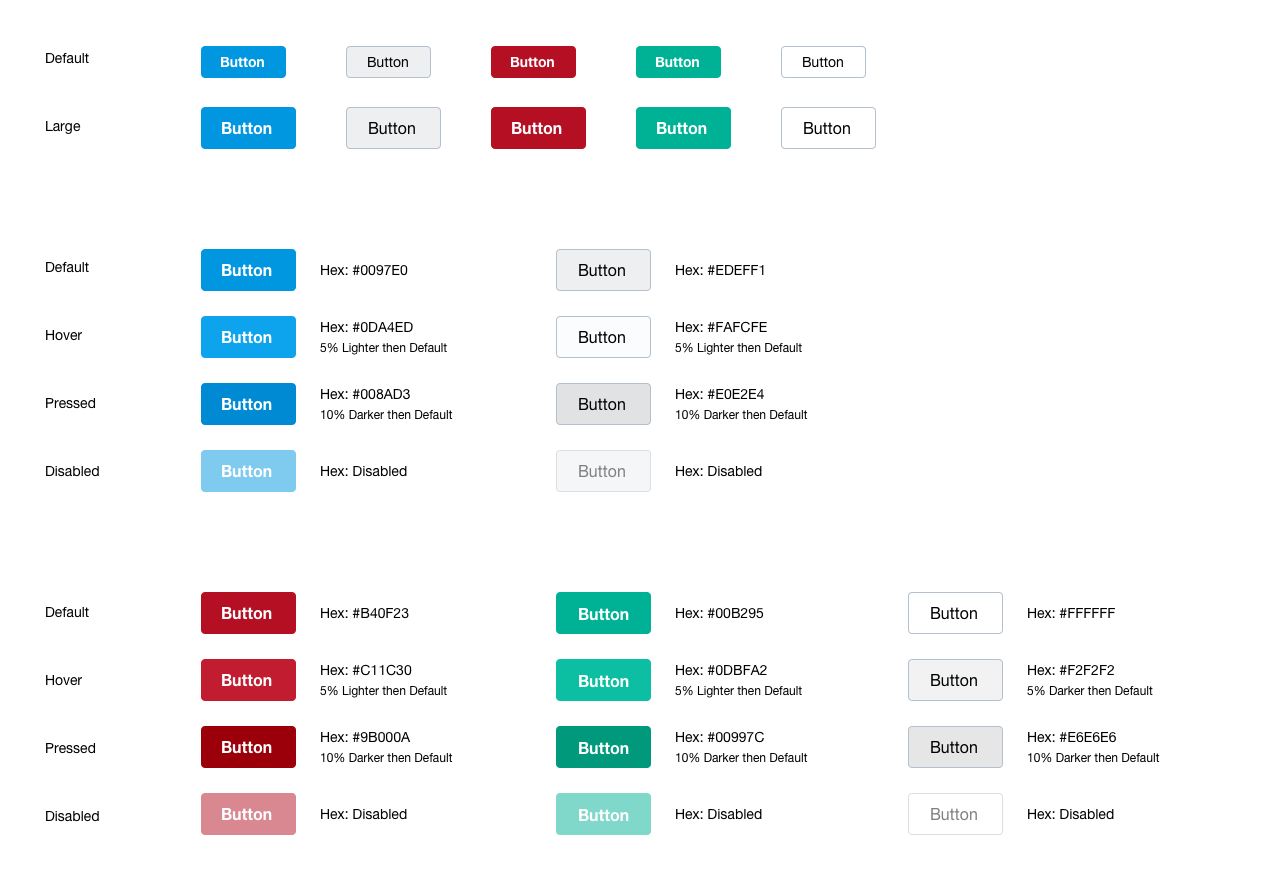
Use buttons to signal actions.
Buttons can be seen across the V3 interface. A button is used to signal related actions. Buttons are commonly seen throughout the product experience.
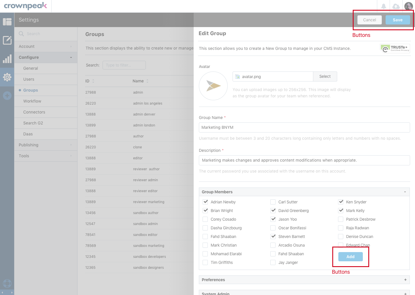
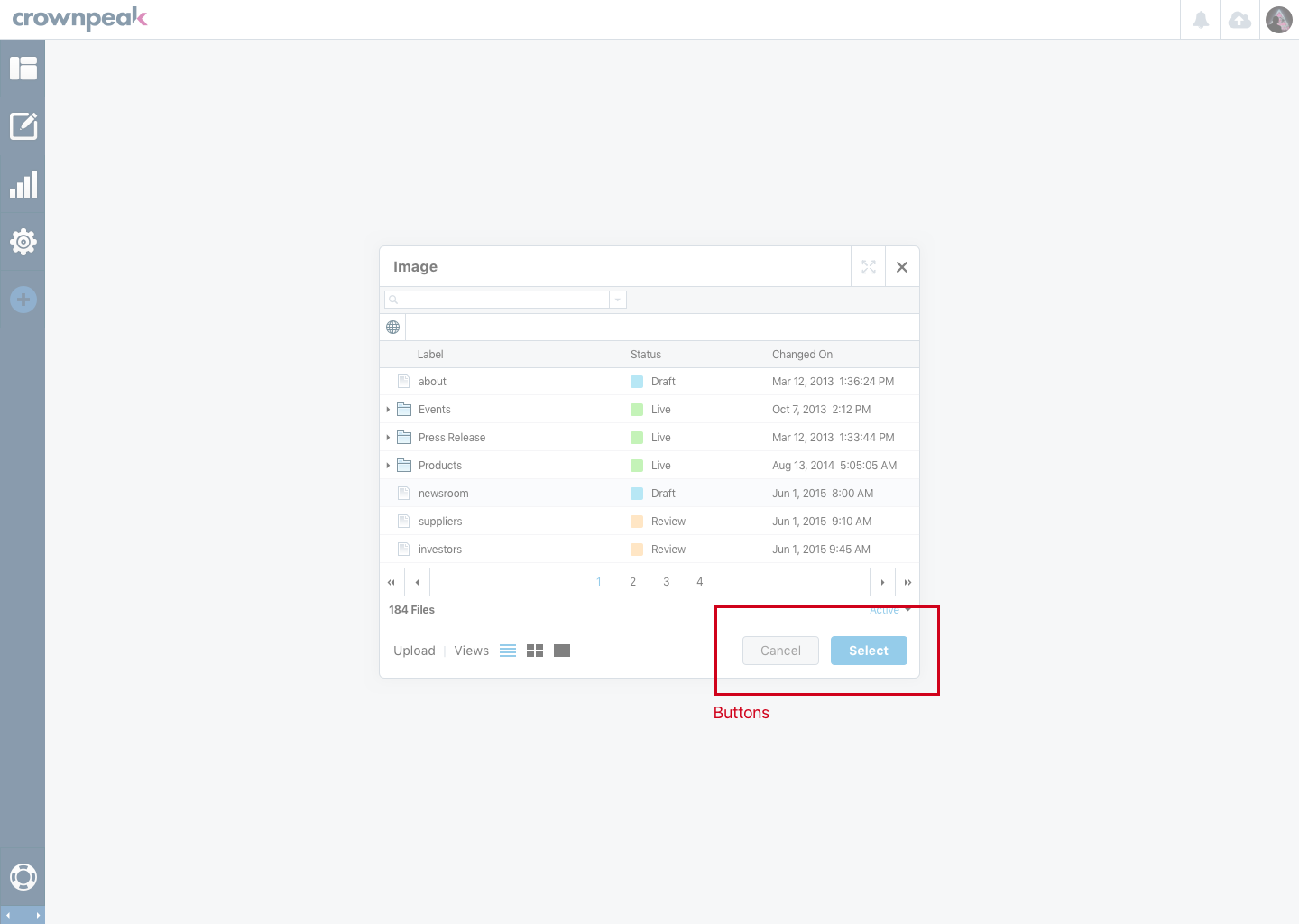
These images display the Buttons being used in the Settings and Content Section in the DXM experience.
Below are functional UI elements for how the buttons should look and feel while being used in the DXM experience.
Display color palette for the button states. Default, Hover and Press.
hex: #0097E0
hex: #0DA4ED
hex: #008AD3
hex: #EDEFF1
hex: #FAFCFE
hex: #E0E2E4
hex: #B40F23
hex: #C11C30
hex: #9B000A
hex: #00B295
hex: #0DBFA2
hex: #00997C
Add class "btn" and one of the five button style classes to a <button> element to output a button.
Additonally include class "btn-lg" for a large button.
Do not modify the height, min-width, or padding of buttons. Add context specific classes to <button> elements to adjust the width of buttons.
<button class="btn btn-primary btn-lg"></button>Default Button
Min. Width: 85px
Height: 32px
.btn-primary
.btn-default
.btn-danger
.btn-success
.btn-info
Large Button
Min. Width: 95px
Height: 42px
Default State
Hex: #0097E0
Hex: #EDEFF1
Hex: #B40F23
Hex: #00B295
Hex: #FFFFFF
Hover State
Hex: #0DA4ED
5% Lighter than Default
Hex: #FAFCFE
5% Lighter than Default
Hex: #C11C30
5% Lighter than Default
Hex: #0DBFA2
5% Lighter than Default
Hex: #F2F2F2
5% Lighter than Default
Pressed State
Hex: #008AD3
10% Darker than Default
Hex: #E0E2E4
10% Darker than Default
Hex: #9B000A
10% Darker than Default
Hex: #00997C
10% Darker than Default
Hex: #E6E6E6
10% Darker than Default
Disabled State
Opacity: 0.65
Opacity: 0.65
Opacity: 0.65
Opacity: 0.65
Opacity: 0.65
These images display the Button visuals for how they should look and be used in the DXM experience.