The main goal of components are to enable visual consistency across user interfaces while delivering more rapid development benefits.
Components are a powerful, clean way of organizing our user interface across products. Placing code into self-contained, reusable blocks delivers visual consistency across user interfaces while enabling more rapid development benefits.
Everything in a UI is a component. This includes buttons, inputs, forms, modals, data tables, etc.
The word component is used not only because this is how the underlying code is written in libraries like Angular and React, but also because pieces of a well-designed UI system should be composable. - Wikipedia page on Composability
Use the Confluence page as a reference for the ongoing Component Team discussions. - Confluence Page
Preview the components that make up the V3 product below.


Top Nav
Top Section Bar
Top Action Bar
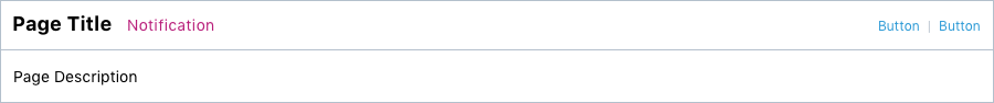
Page Title, Description and Buttons
Pagination
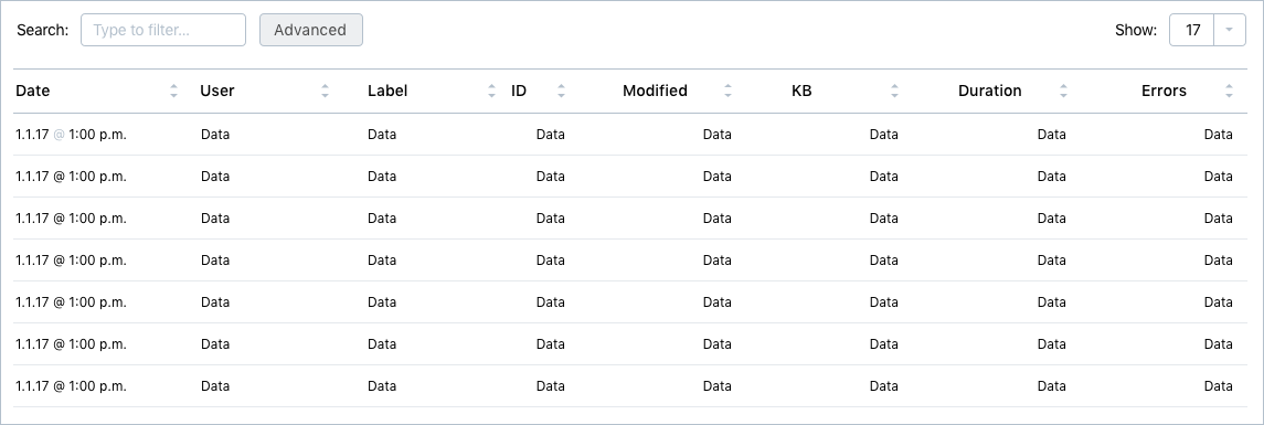
Data Grid
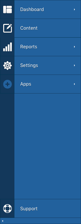
Left Nav
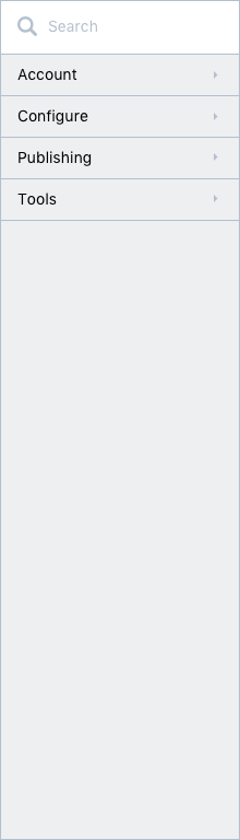
Left Nav Sub
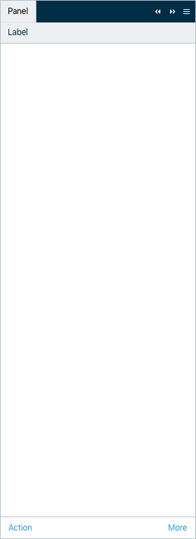
Panel
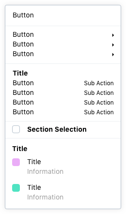
Menu Light
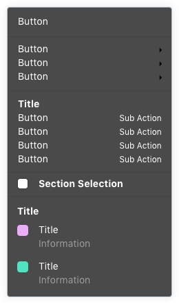
Menu Dark
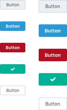
Buttons
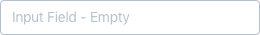
Input Field Default
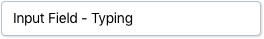
Input Field Typing
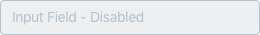
Input Field Disabled
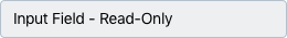
Input Field Read Only
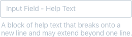
Input Field Help Text
Input Field Input w Tooltip
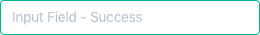
Input Field Success
Input Field Warning
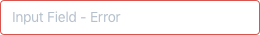
Input Field Error
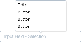
Input Field Input w Selection
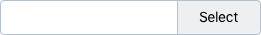
Select
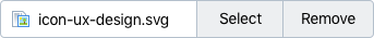
Select or Remove
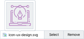
Select or Remove w Hover
Radio Selections
Checkbox Selections
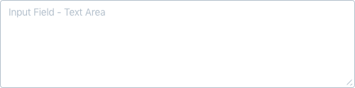
Input Text Area
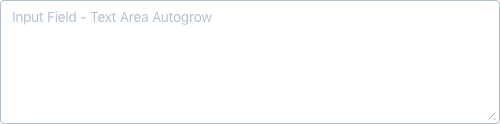
Input Text Autogrow
Global Nav Bar
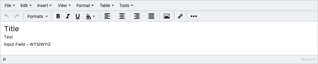
Input WYSIWYG
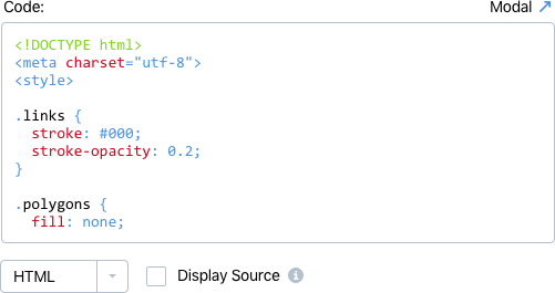
Input Code
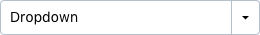
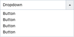
Dropdown
Dropdown Selection
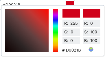
Select Color
Select Color Modal
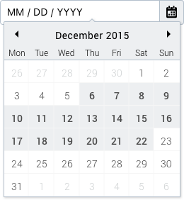
Select Calendar
Select Calendar Selection
Pane Collapsed
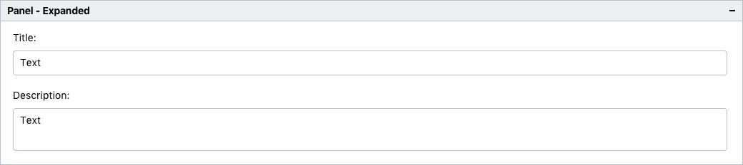
Pane Expanded
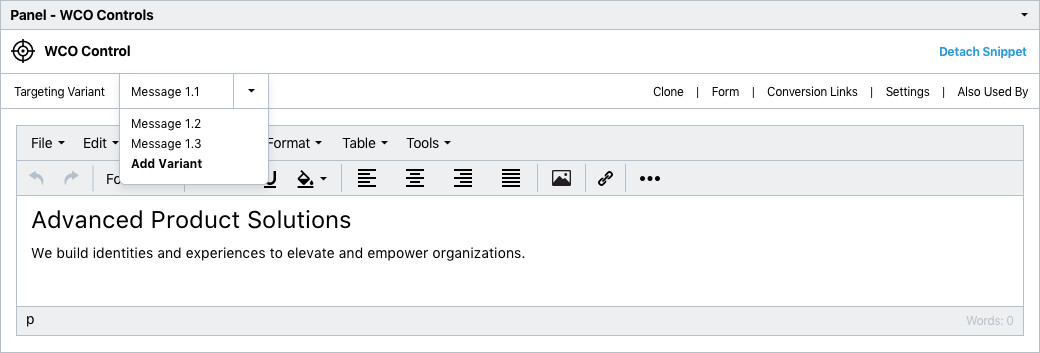
Pane WCO
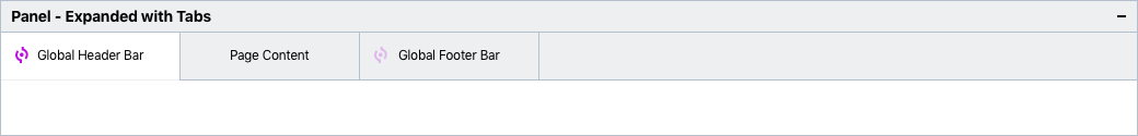
Pane Expanded w Tabs
Tabs
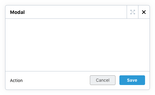
Modal Small
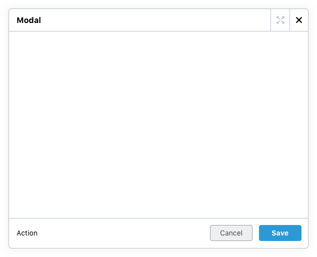
Modal Large