Form controls can be seen across the V3 interface. Controls are made up of common controls such as input fields, dropdowns, radio, checkboxes, selectors and more. These controls are commonly seen in Editing, Settings, Search and Form Building experiences.
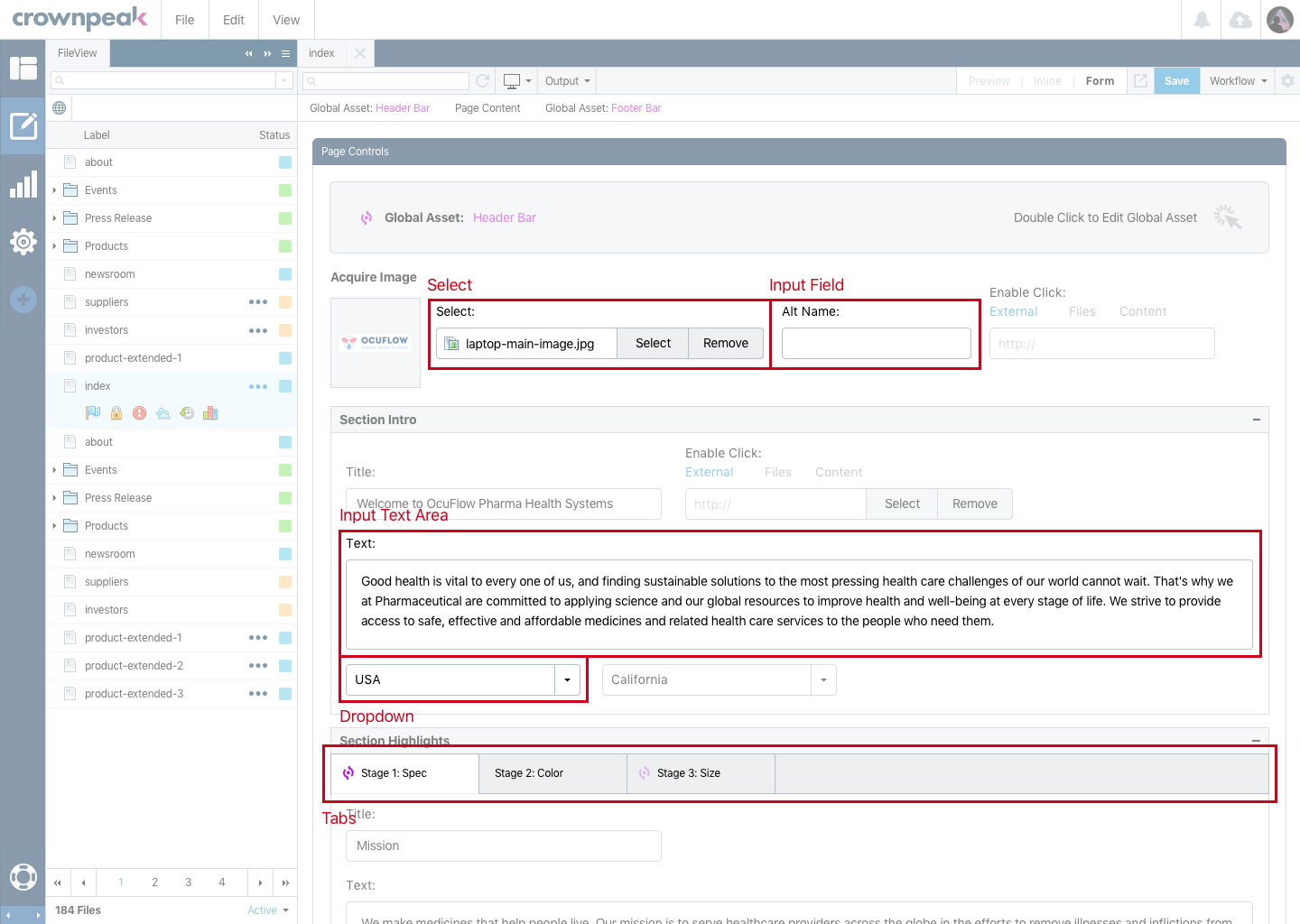
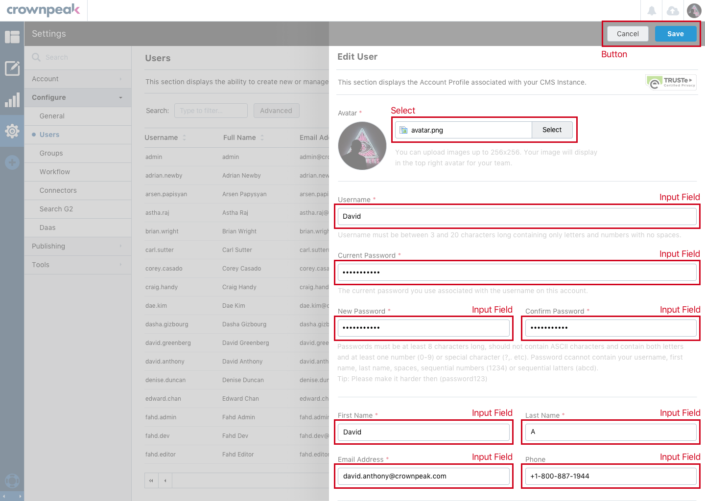
These images display the Form Controls being used in the Content and Settings Section in the DXM experience.
These images display the Form Control visuals for how they should look and be used in the DXM experience.
IMPORTANT - Full overview of the Form Controls use cases can be seen > here.
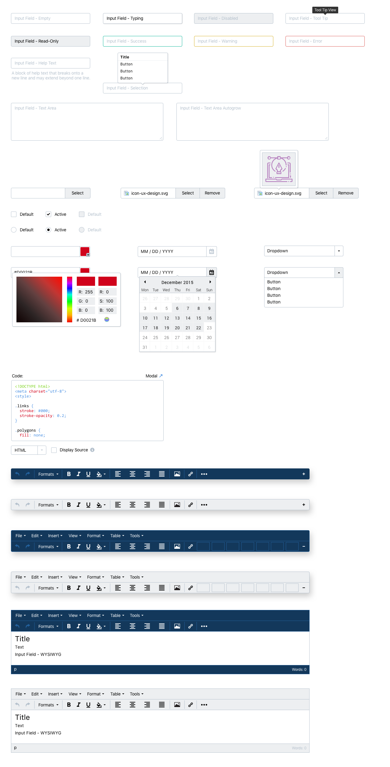
Below are functional UI elements for how the form controls should look and feel while being used in the DXM experience.
All textual elements with .form-control are set to width: 100%; by default. Wrap labels and controls in .form-group for optimum spacing. Form controls are used across the editing experience and allows users to enter information into a page.
I began coding up some items using Bootstrap as the base layer. Then created a CSS override file to style correctly for the V3 interface.
Original references can be seen at this link.