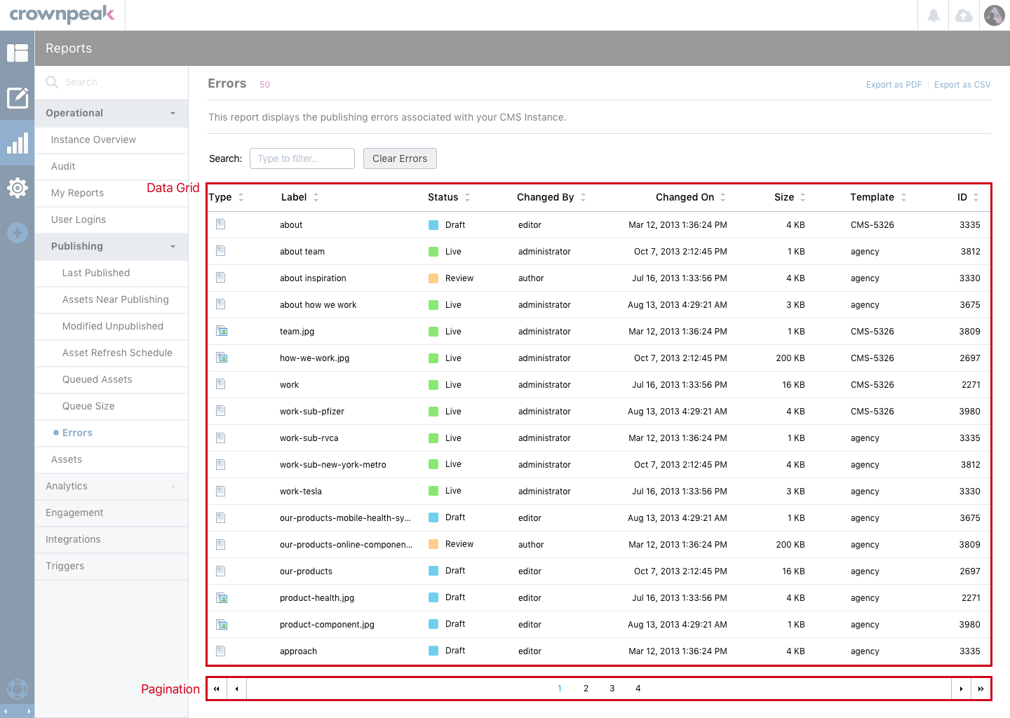
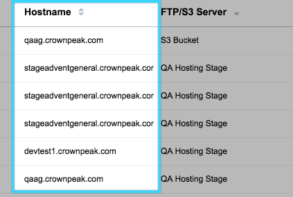
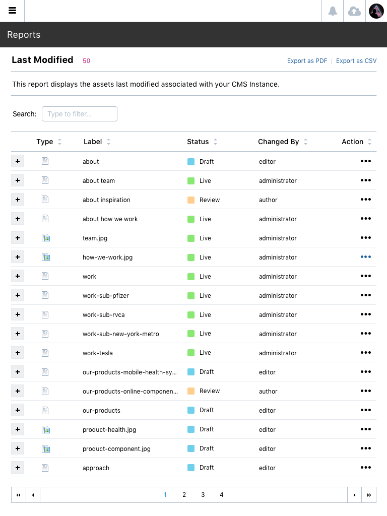
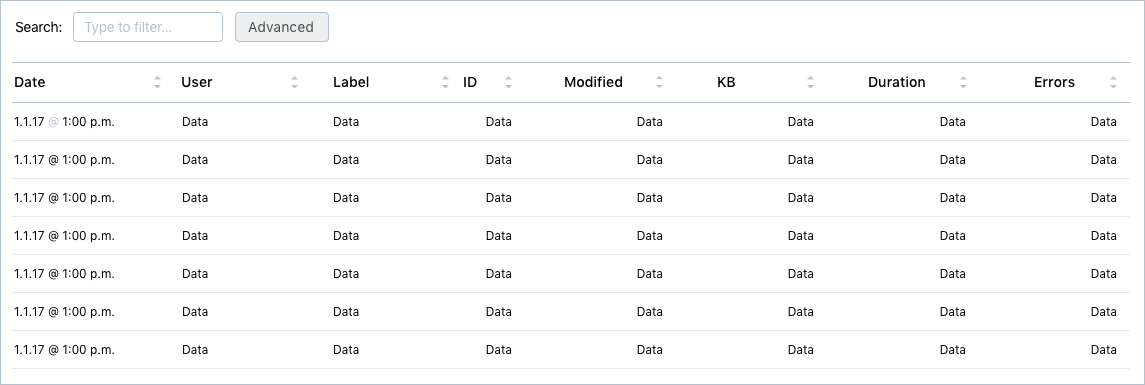
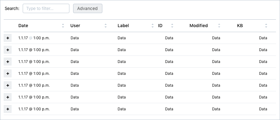
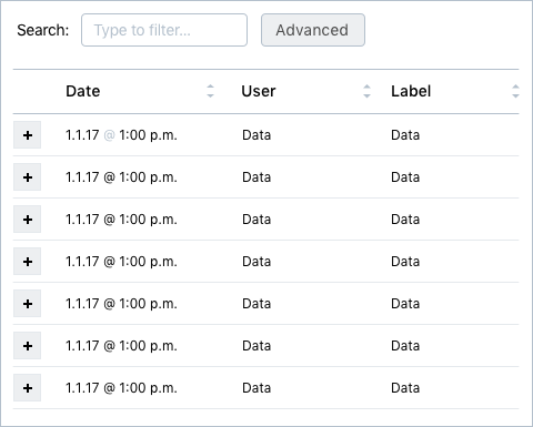
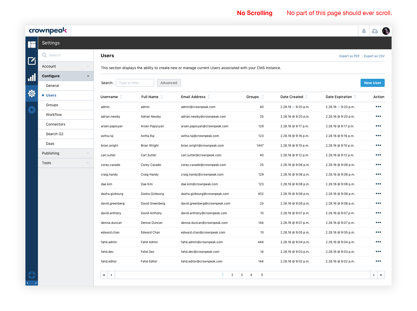
Data tables can be seen across the V3 interface. The data table is used across the product and allows users to discover, sort and manage large amounts of information. These controls are commonly seen in the Editing and Reports experiences.
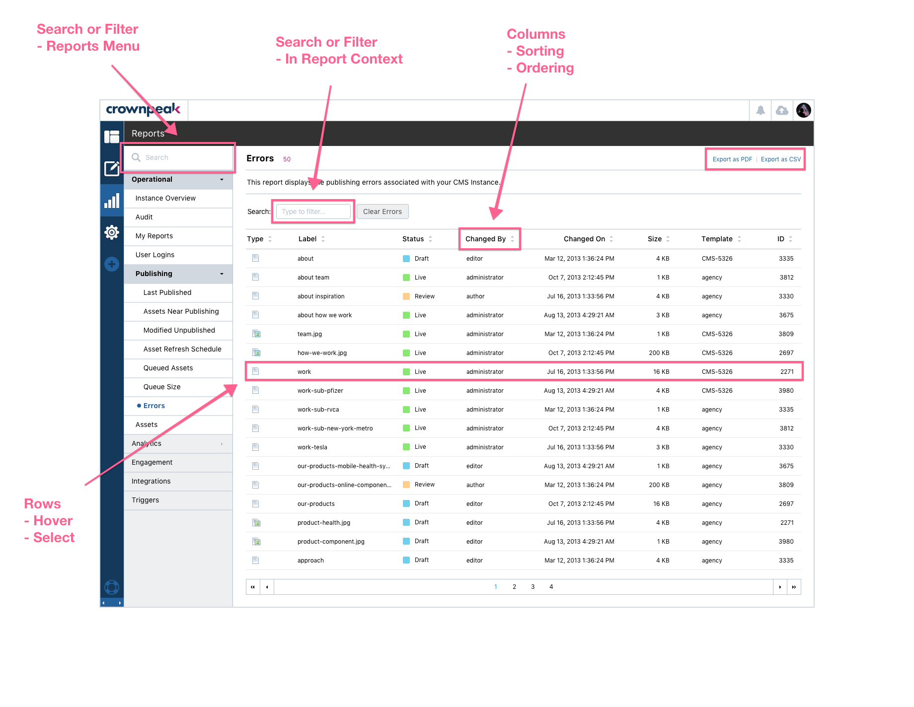
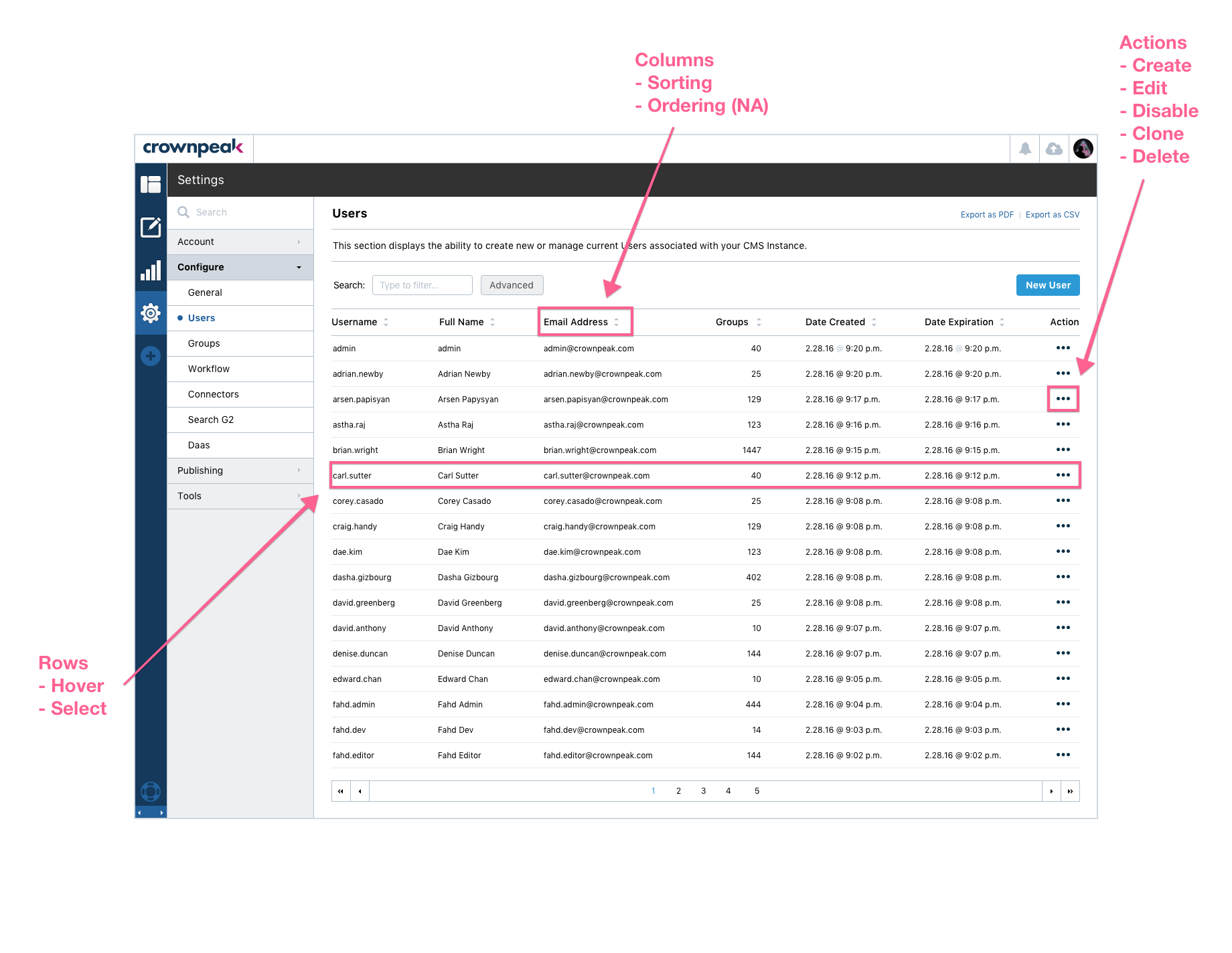
These images display the Data Table being used in the Reports and Content Section in the DXM experience.
In general, data in columns will fall into a few types
All datatables will follow a few rules:
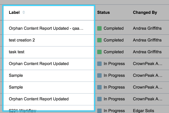
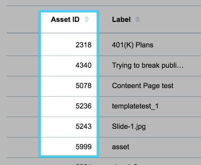
The Primary Identifier is the field that the user would most likely use to reference a data point in the grid. This changes depending on what data is being displayed.
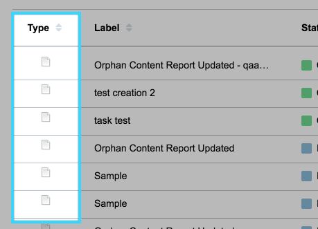
If a grid's data points include an icon (visual cues of file types, for example) and sorting by icon is a requirement, they will have their own column.
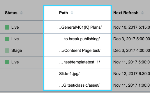
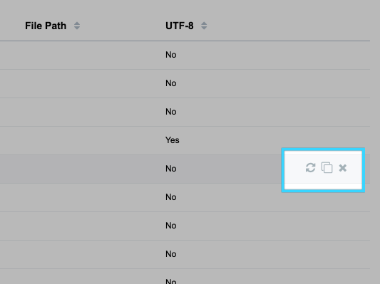
Filepaths are critical information pieces of information for users of the CMS.
...our/filepath/example.pdf
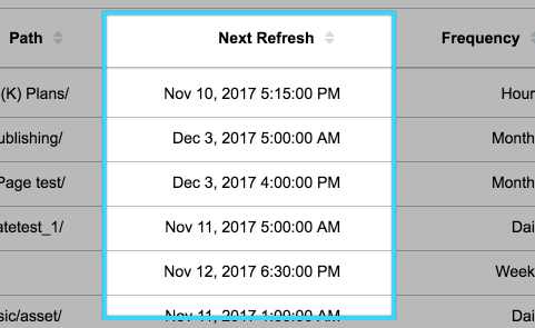
Dates use the Crownpeak cpTimezone directive, which leverages Angular's DatePipe to format timestamps to human-readable strings. Formats in this section reference arguments available in DatePipe. Docs of Angular's DatePipe
"medium" format by default
March 26, 2017 12:36:21 AM
"shortDate", with a tooltip displaying full datetime information.
3/26/17
Number-type data include general numbers, as well as File Sizes
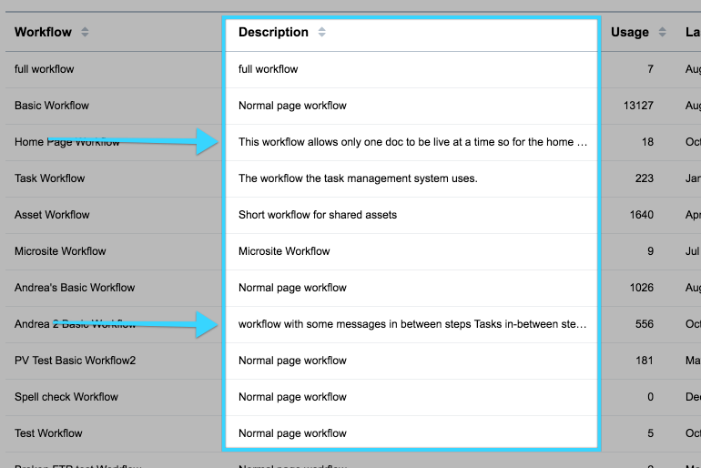
Long String fields could include Descriptions, Errors, Notes, Comments, etc. These long strings are typically expected to overflow from their cell.
Action Icons are clickable icons at the end of a row that can execute an action on the respective row.
All other data strings should not take an explicit width, and should instead automatically adjust to evenly distribute the remaining width on the grid.
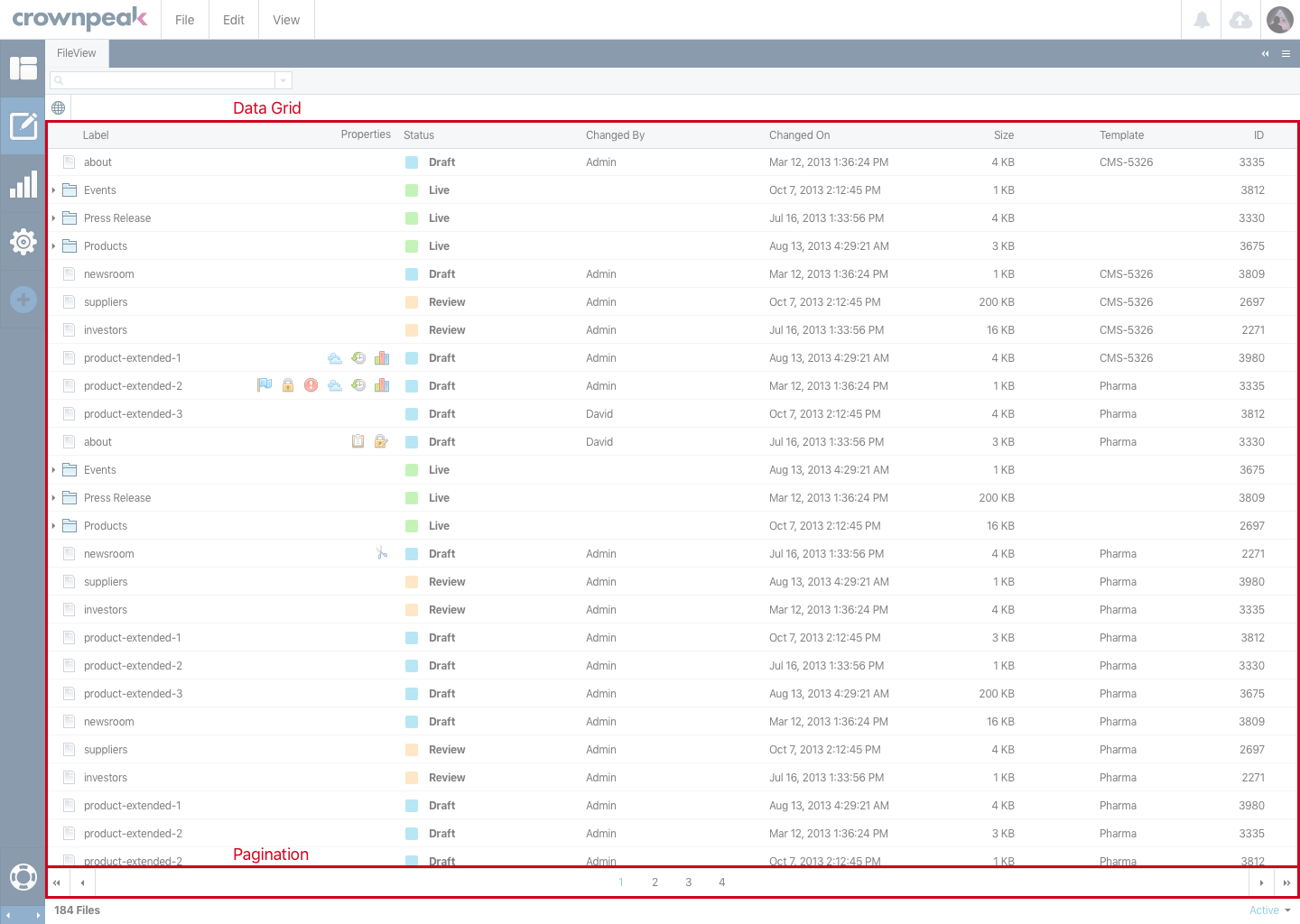
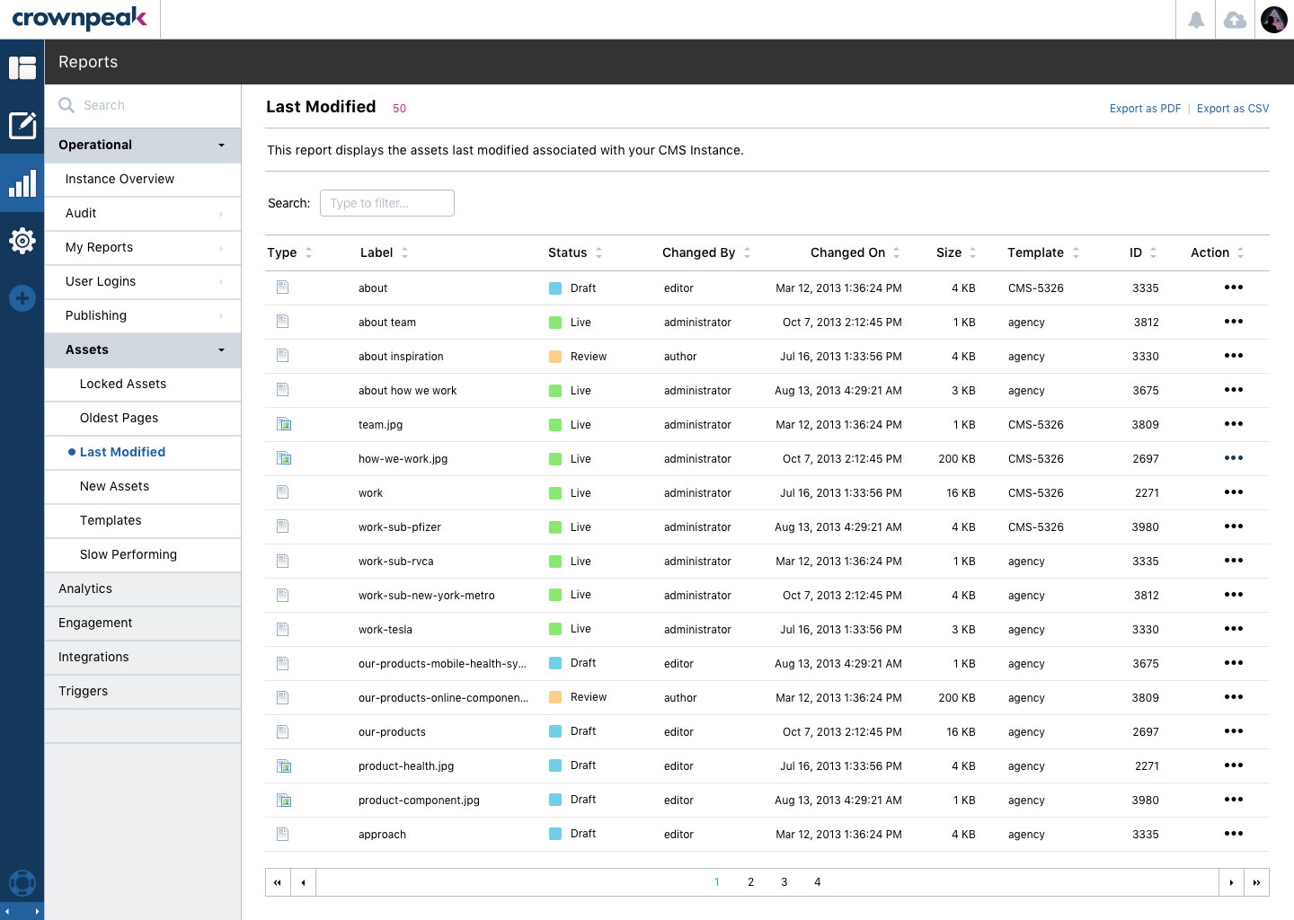
These images display the Data Table visuals for how it should look and be used in the DXM experience.


How does a user take an action with a specific row?
• Double-click the entire row?
• A specific column with clickable links/icons?
• Right-click menu?
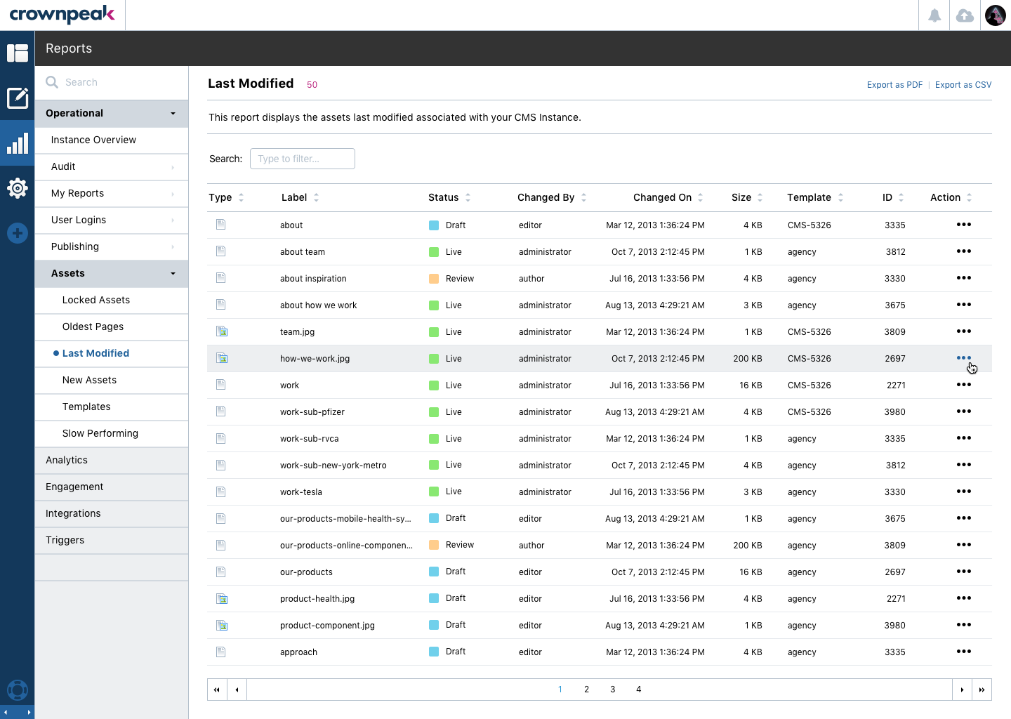
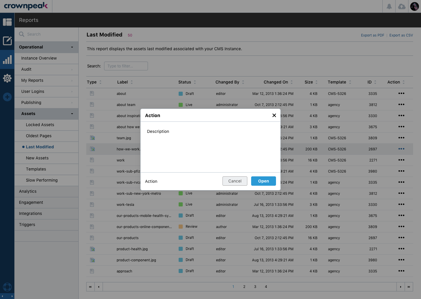
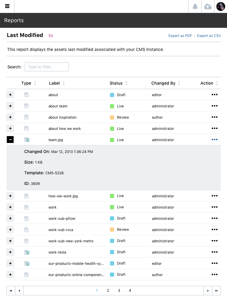
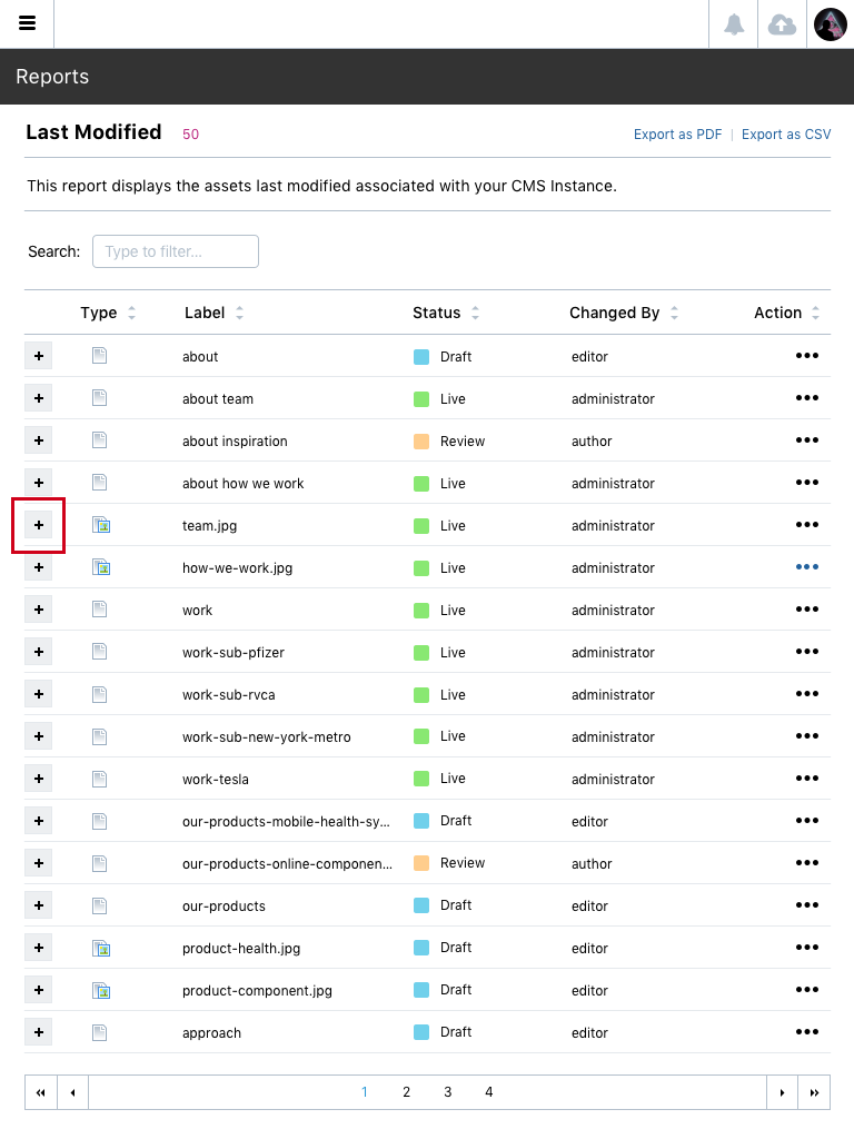
Rows in a Data Table can vary with the type of information that is presented. There are two types currently. Display Data and Actionable Data. Display Data simply shows information associated with the report. This row is not clickable but can have an icon in it that is clickable. Actionable Data shows presents information that has actionable states on it. This row can be clicked, right clicked as well as have individual icons that are clickable.
How is it conveyed to a user that there is an action associated with a row?
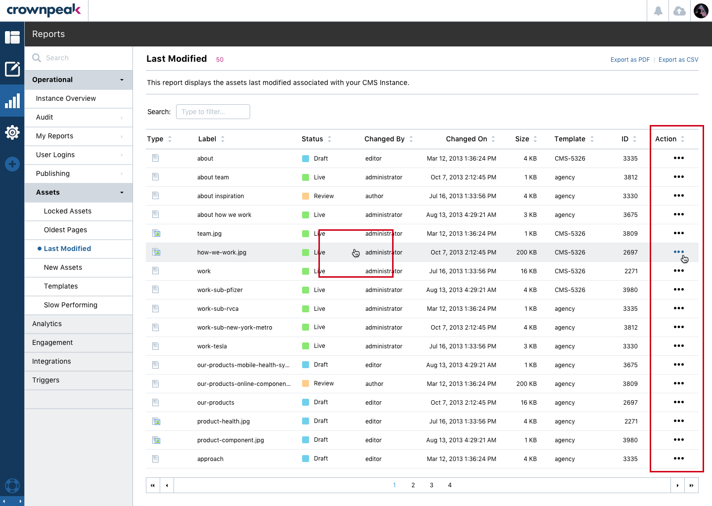
If using a Display Data table there is no reference for action. If using an Actionable Data table there are two ways of displaying actions. 1 is hover effect on rows. 2 is adding an Action column with the icons to symbolize. Reference Image.
Does the mouse cursor change to a hand?
Yes. Reference Image. Above to see the hand displays when actionable.
What about the experience for users that don’t have a mouse? (cell/tablet?)
Our focused delivery currently is for this to work on Desktop and Tablet. The ability for the mouse cursor to change would not be present when viewing from a tablet. However the user will still have an understanding that a row contains an action via the Action icon.
Can the number of items in a page be changed from the current default of 25?
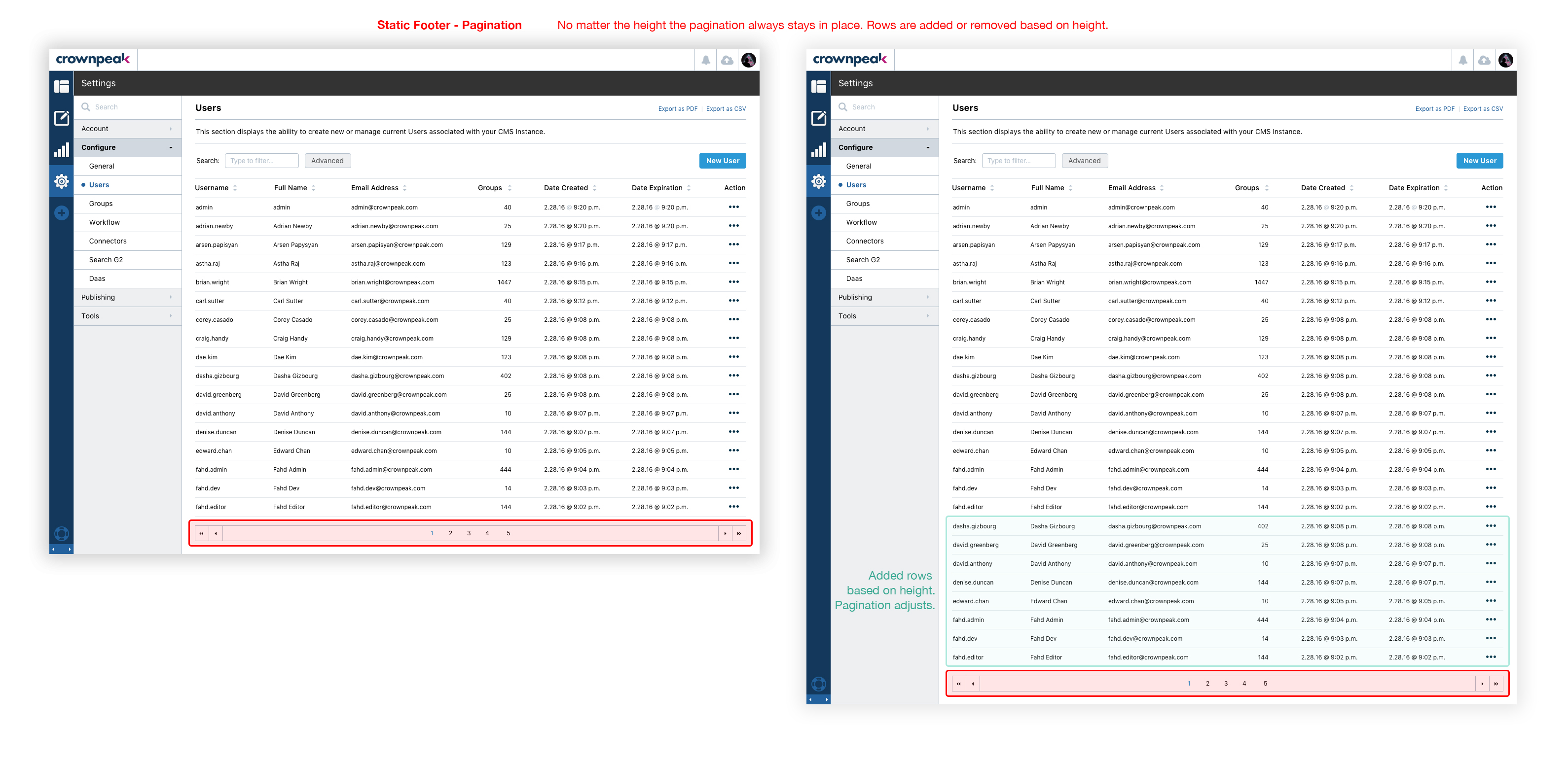
The vertical window size should always define the amount of rows displayed. If a user needs to navigate to more information they can 1. use the pagination or 2. direct search to discover information.
Are there visual elements to indicate that a column can be resized?
Columns should not have the ability to be resized. However if there is to much information to fit in the column we will present in 1. ellipse rollover or 2. clickable modal window.
Should an icon be displayed to indicate sorting capability?
Yes. An icon is displayed. Reference Image.
Should there be zebra striping on the rows? On the columns?
No. Not necessary, but if needed we can easily enable via this class "table-striped"
How does the grid respond to changing viewport widths and heights? Are columns hidden?
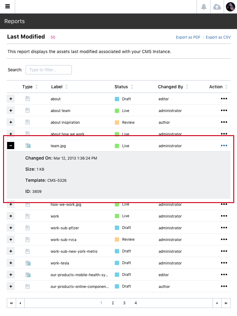
Yes. Columns are hidden. When viewing on resolution that is smaller then we have available for the columns a icon will display for Expand and Collapse. Columns are always accessible. Users will need to expand the row to see the columns that do not fit inside of the available screen size. Reference Image.

Example of a working Data Table functionality > Reference No Columns | Reference With Columns